This wonderful and sweet bride and groom loved to be unique and wanted everything custom, and because they were open to so many creative possibilities.... it made my job TONS of FUN! I created several different pieces for this lovely bride and groom starting in February of 2016 for their New Years Eve wedding on December 30, 2016. I am just SO excited to finally share all of these pieces. This blog post has most of pieces that were designed for this couple. I absolutely loved having the opportunity to be a part of such a special year for these two.
This couple really knew how to think out of the box, and after getting engaged, they had a "Proposal Reveal Party" to ask their groomsmen and bridesmaids to be in their wedding. They gave each bridesmaid and groomsmen boxes as a gift and in the box, I created the signage "Will you be my Bridesmaid", and fold out packet for her bridesmaid's gift box, and the magnets. All the photos from this party are taken by the talented Cindy Harter and I so appreciate her sharing these photos!
PROPOSAL REVEAL PARTY


For the groomsmen boxes, I created the signage, magnets, and "Eat, Drink, and Suit Up" tags. These photos by Cindy Harter are beautiful, if you need a great wedding photographer, she is amazing!!


SAVE THE DATES- part one
The next step for me was to design the Save the Dates for this amazing couple. This couple wanted their Save the Dates to be fun, elegant, and of course add some glitter and confetti since it is a New Years Eve wedding. The Save the Date was printed in gold foil on blush Arturo paper (double thick) with the Accommodations Card in confetti gold foil on Crane Lettra Pearl White paper. I wrapped these together with a glitter belly band and glued a gold foil label with their names printed on the Arturo blush paper, mounted on top of the Crane Lettra Pearl White paper (to frame it). The envelopes were white with gold glitter envelope liners. I assembled and mailed these out (which is a service that we offer) at the end of February, to give guests time to make accommodations during the holiday weekend.


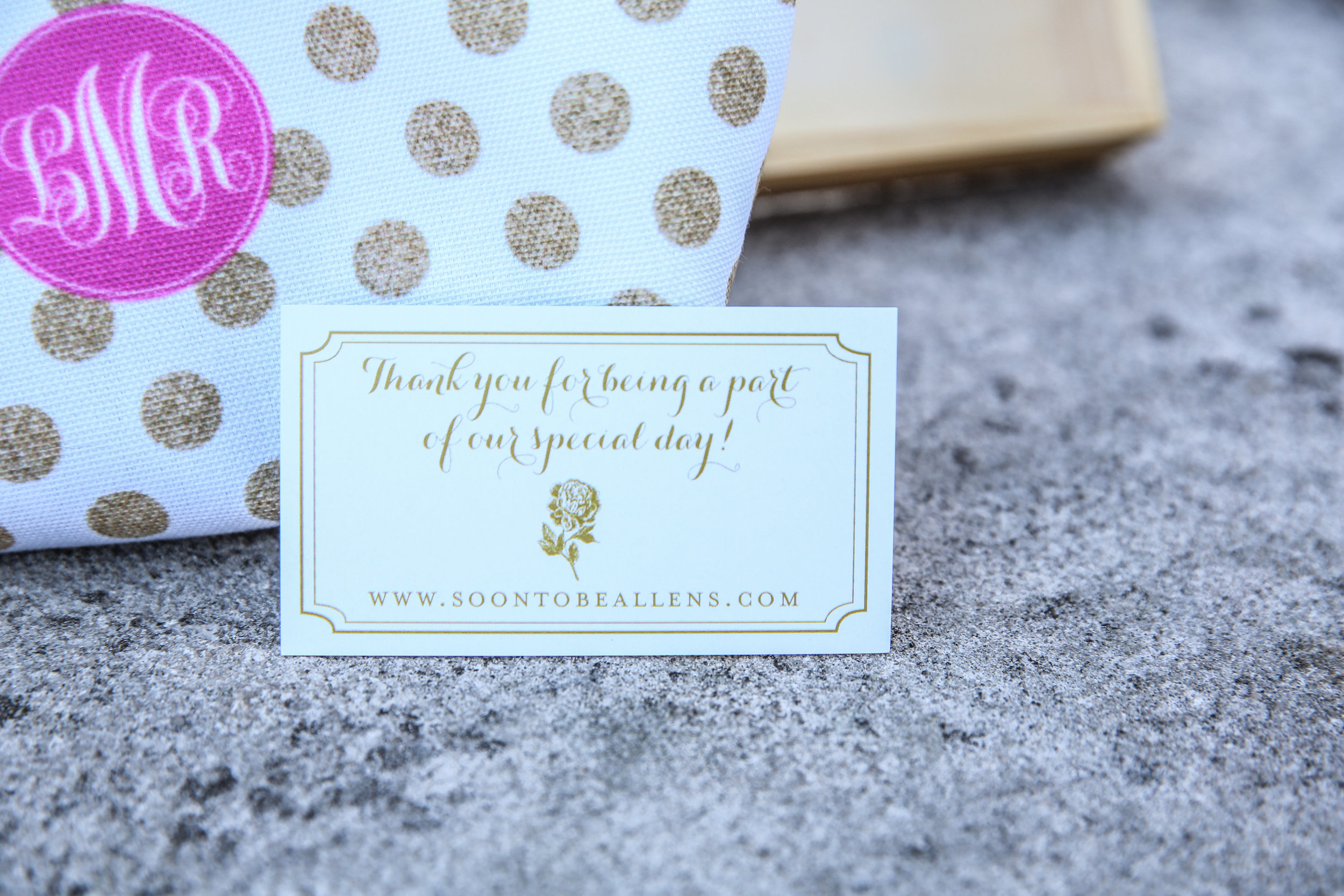
THANK YOU CARDS
This couple wanted a variety of designs for their thank you cards, so I created some different variations for them to choose from. (photos to come)
SAVE THE DATES- part two
Because the Save the Dates were mailed out so much earlier, Amanda and Greg wanted to mail out a reminder photo magnet for guests to put on their fridge (photo taken by the talented Cindy Harter). We had these printed on 5x7 size magnet with rounded corners, and a peony design. The envelope was a textured blush. We printed the addresses in the same font as the design, and stuffed and mailed these out in July, so that guests would be reminded of their upcoming wedding on New Years Eve.

ROOFTOP PARTY
The happy couple had a rooftop engagement party to recreate their first date. I designed some of the printed materials for this party. (photos to come)
BOXED WEDDING INVITATIONS- Now to the best part.....
This bride and groom's wedding was a remarkable event to remember, so they wanted the invitations (the first impression of the wedding) to be just as spectacular. This bride and groom decided on a boxed invitation design so that guests can have a keepsake to remember their wedding weekend. First, I was to design the custom monogram that the bride and groom purchased to use throughout their wedding (the monogram was used as a backdrop, and on other printed materials). I started with a crest design, and then went to a painted crest, and ended up with a beautiful combination of their initials in the script and block font with a peony. I had one version which was painted watercolor, and one version which was not painted (for foil printing). Here are the two final monogram designs:
These invitations have many layers, so let me do the best to show them.....
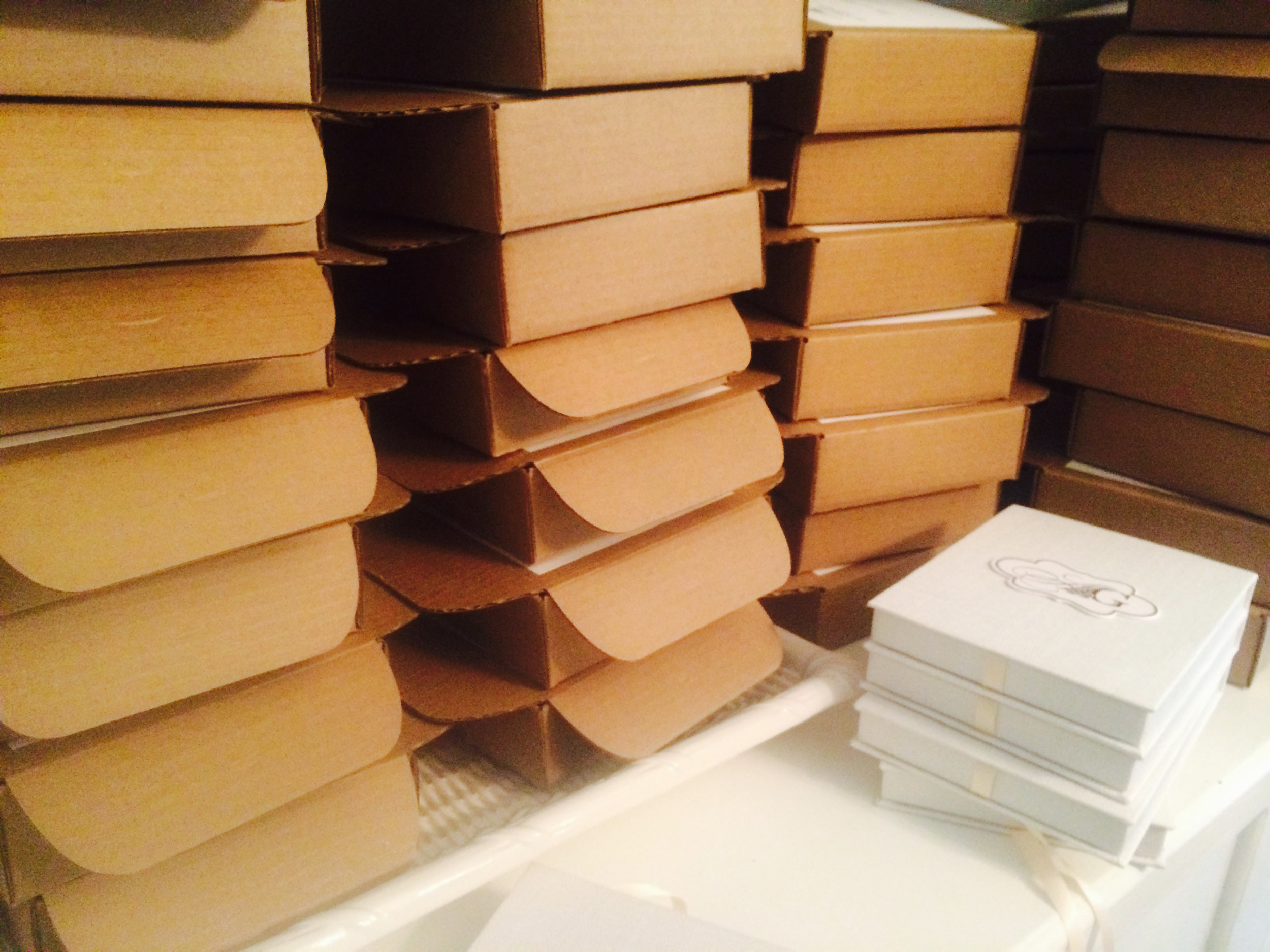
1. The outside was in a cardboard mailer box. This box had custom labels with the guests addresses and custom stamps printed with their painted monogram. When opening this box, there was a ribbon that tied the invitation box together. This kept the box secure, and also made it pretty for guests when they opened the box to unwrap the ribbon, like a gift. Here are photos of part of the assembly process with the boxes....

2. The box envelope was made of pretty metallic crystal pearl paper (which had a shimmer to it) and our calligrapher addressed the names of each guest on this box, serving as an inner envelope. The back flap of this box was a die-cut shape, with the monogram and return address printed in gold foil.


3. The invitation box was made out of a white linen fabric, and the custom monogram was printed in gold foil on a die-cut shape which was mounted on the linen box. The box opened from top to bottom, and had blush ribbon on the sides to tie together.


4. When opening the box, the invitation sat on top with a pull out ribbon, so that guests could easily take the invitation out. The invitation was printed on 8-ply thick beveled and painted edges in gold foil, with the peony design and invitation printed in gold foil.
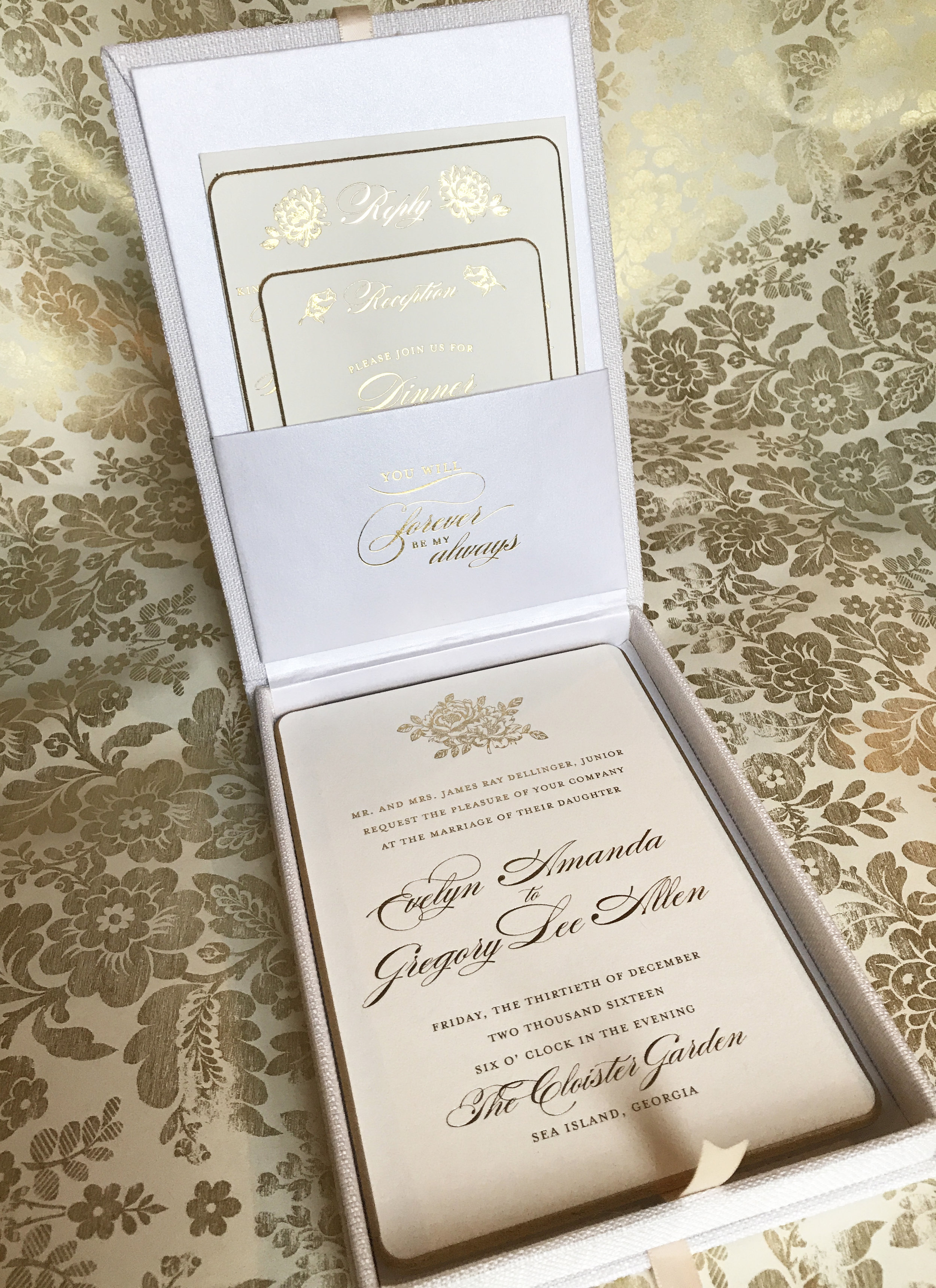

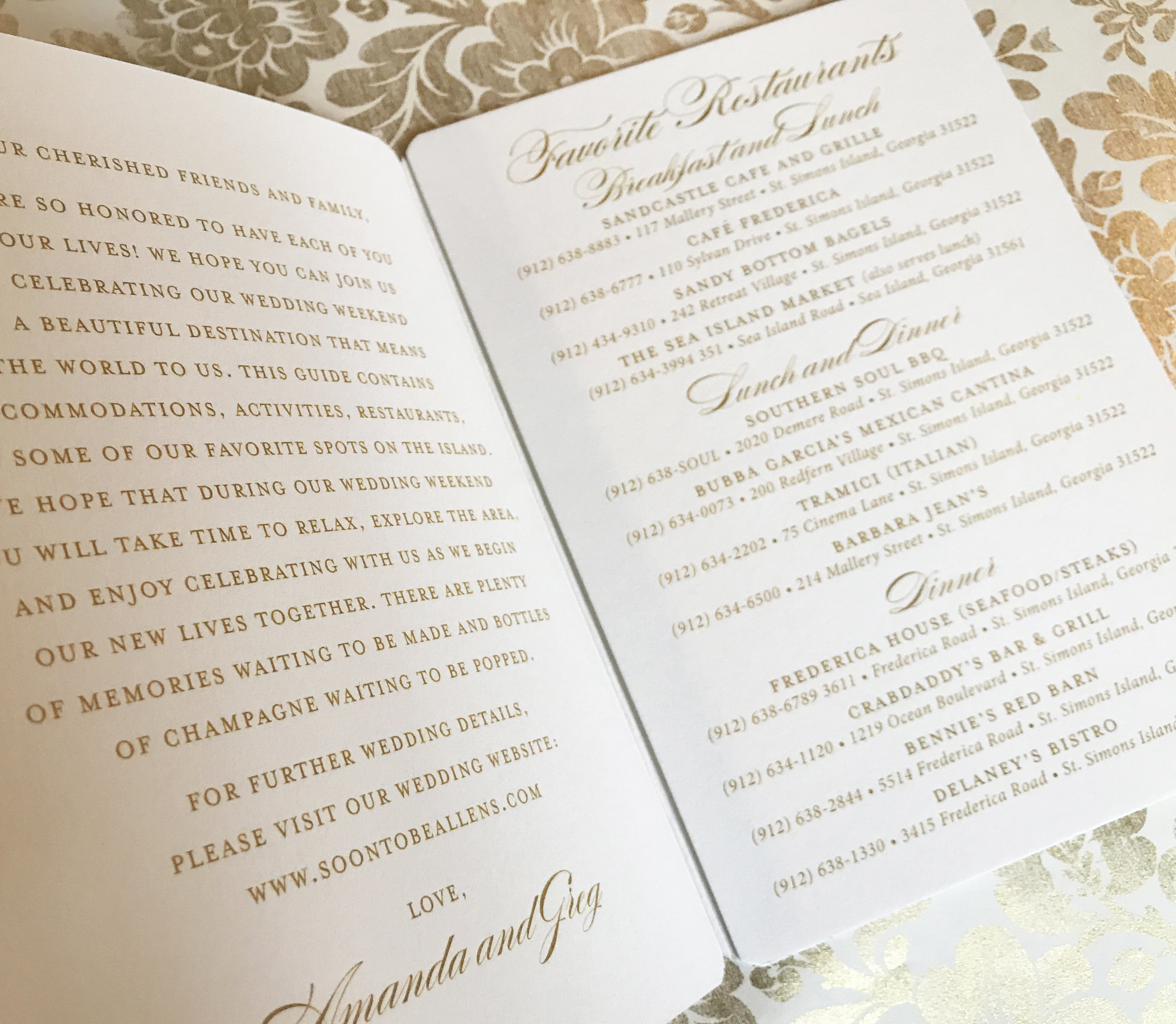
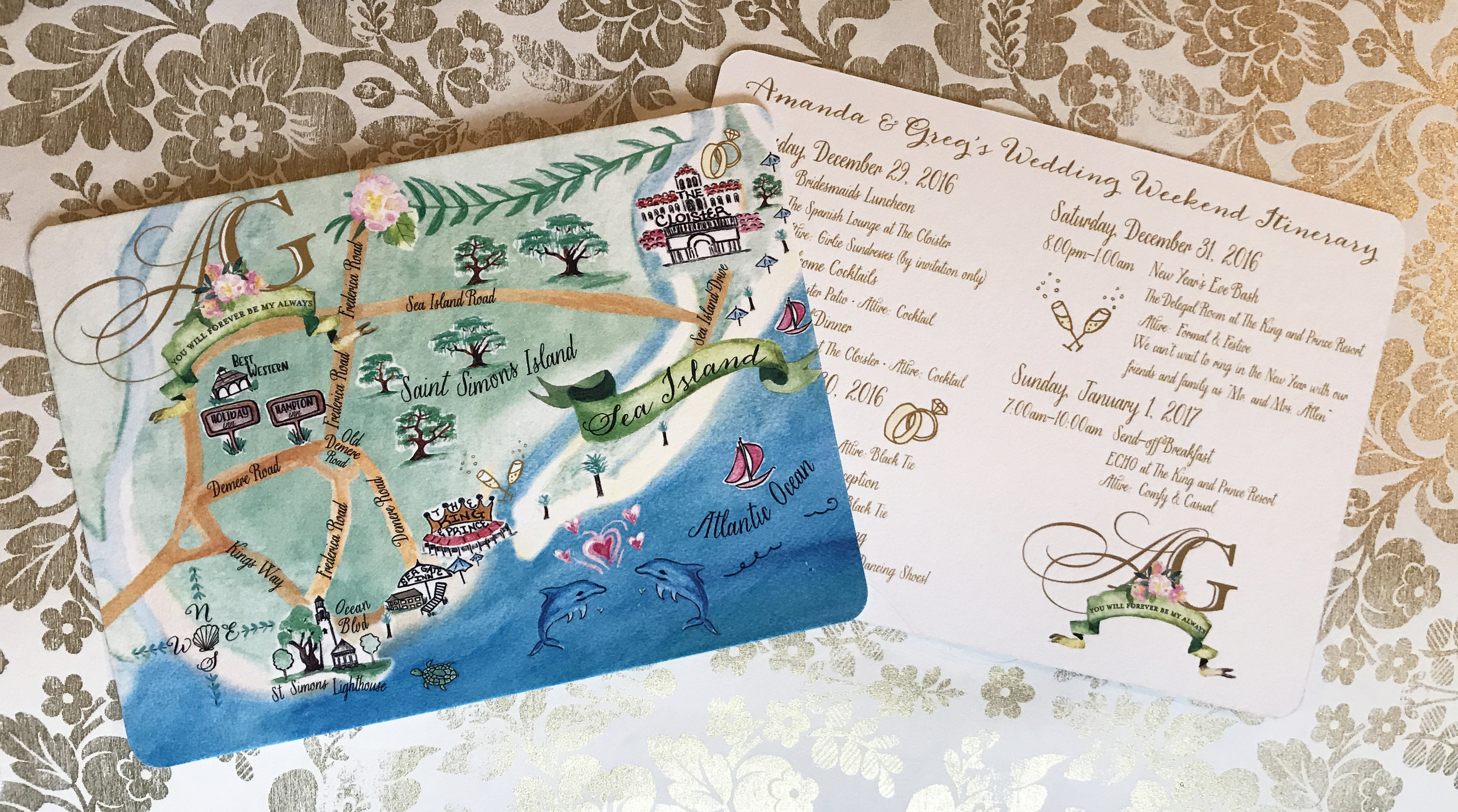
5. Underneath the invitation is a packet of information for the guests that is wrapped in a metallic pearl belly band (flat printed). The pieces include a tri-fold packet of information for the guests (restaurants, things to do, and accommodations on the island), and a hand painted map (I had SO much fun painting this!) with rounded corners and double thick paper and the wedding weekend itinerary for the guests printed on the back. These pieces were printed flat.


6. On the lid of the box is a quote printed in gold foil on the pocket of the crystal metallic pearl paper.

7. Inside the pocket of the lid is the reception card in double-ply thickness with beveled painted gold edge and rounded corners, printed in gold foil. Also the reply card is printed the same way and thickness as the reception card, and being the reply card is the reply envelope with the custom stamps to match the invitation suite.


And there you have it! We assembled and boxed up each invitation suite with care, and mailed them out to the guests in October.
WEDDING CHECKLIST and ITINERARY
I also designed and printed the wedding checklist and itinerary to mail out to guests in November as a fun way for everyone to get excited and backup for this holiday wedding.


FIRST LOOK BOOK
This sweet bride wanted to surprise her soon to be husband with a "first look book". This gift was given to the groom on their wedding day, and she wrote him an endearing note. The bride wanted the book to have whimsical illustrations and a hard cover. I illustrated and designed this book as a special piece.
And there you have it! The wedding was so memorable for guests and it was such a remarkable event for us to be a part of. Thank you Amanda and Greg, for hiring Tickled Ink to design all of these special pieces for your wedding. Also, as a thank you, Amanda and Greg created a professional testimonial video for us, which you can view HERE.